Sheila Hicks: Weaving as Metaphor
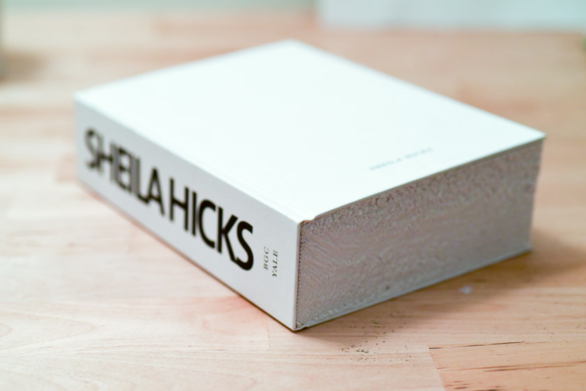
Do you ever think of an artwork, or an iconic designed object, and just assume you can never have it? It was like this for me. I saw and ogled a book as if it were a status symbol. I believe its first edition may have been - it sold out repeatedly, and is now in it sixth reprint. I just assumed I’d either never afford it, or never find it.

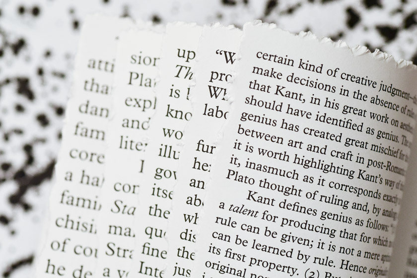
Lucky me - a few years later, I finally have it! It seemed scary to unwrap the plastic and reveal the mostly-white cover with rough edges, similar to how a tall stack of watercolor paper might feel. The book itself is a beautiful thing to handle. It won the ”Most Beautiful Book in the World" Prize at the Leipzig Book Fair, and most designers who judge people by their bookshelf seem to have it.
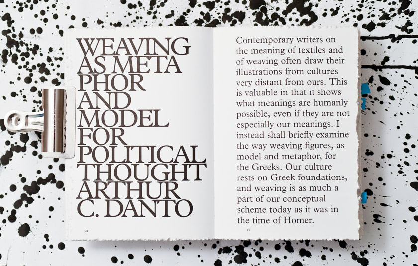
Irma Boom’s designs focus on one single, strong idea at a time. In typesetting of Sheila Hicks, she started the introductory essay by Arthur Danto, Weaving as Metaphor, in a large type. The type size became smaller and smaller on the next pages, reflecting the variation of texture in Sheila Hicks’ woven artwork.
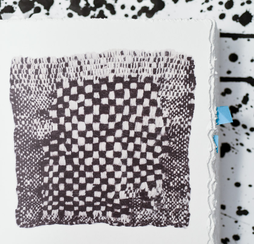
The book works for me on two levels. I nerd out on book design of course, but the content is worth a deep study as well. Sheila Hicks’ small scale woven works speak to me because they represent many abstract concepts in modern art in a very tangible medium. Fibers weave together, and colors match to move beyond materials and work so well, it is abstract.
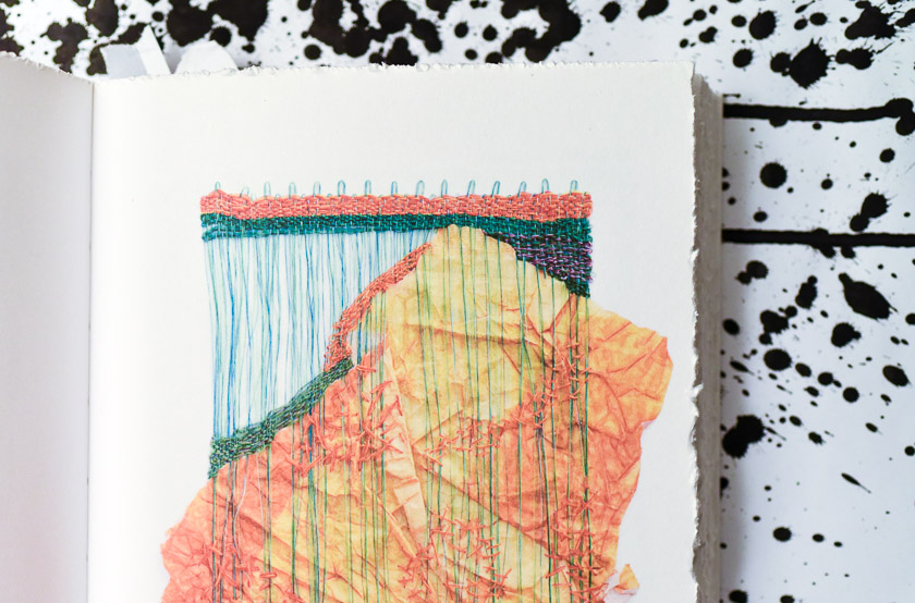
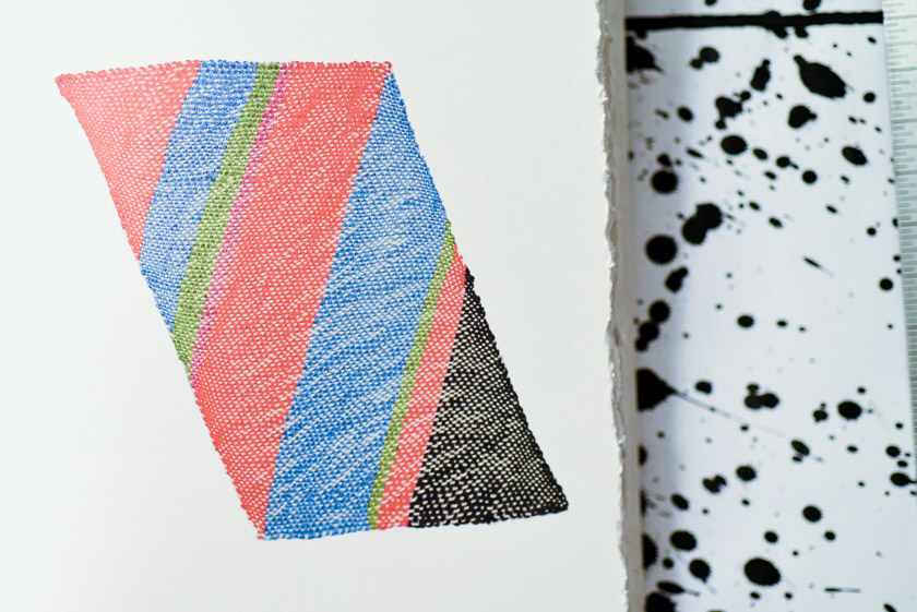
I keep coming back to this book, as an object, and as a library of inspiration in woven-fiber form. It’s a beautiful example of simple ideas taken to their maximum, but left pure and uncompromised. It’s helpful when I need direction in my design work. It helps me remember to express an idea simply.