The Interaction of Color
When struggling with color or hierarchy for a design project, look for answers in the minimalist works by Josef Albers
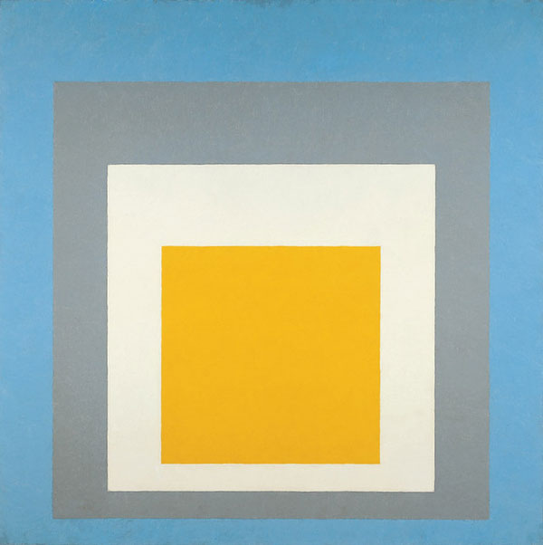
Homage to the Square is a series of minimalist works by Josef Albers. He painted these compositionally very similar pieces for many years, but the subtle variations in color combinations allowed a large field for exploration.
They exemplify minimalism in painting, but I also admire how much nuance (or shall we say complexity) there is in every single one. The interplay between subtle shades and tints of a single color, or the effect of a combination of harmonious colors gives each painting a unique meaning and an unmistakable effect.
Albers as reference
Because of how directly we experience the spatial effect of color combinations, these minimalist works can be great study assets for graphic design. In addition to Albers’ more pedagogical The Interaction of Color, I believe the squares can serve as a great reference for solving design problems. When we want to accomplish a specific thing, we can refer to Albers’ solution.
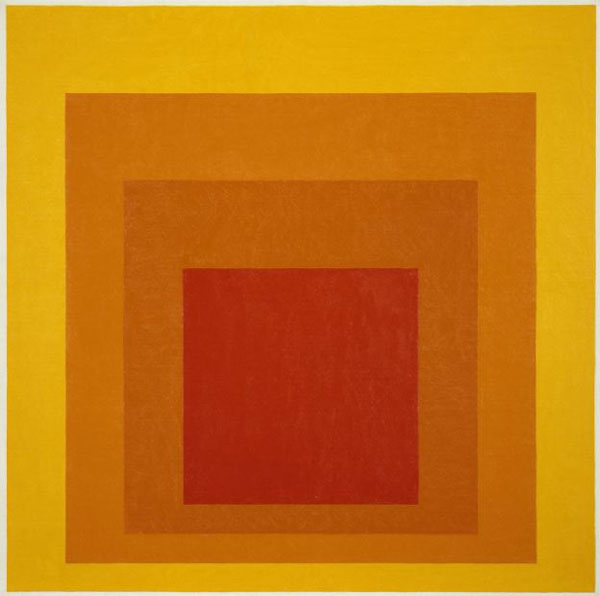
Glow
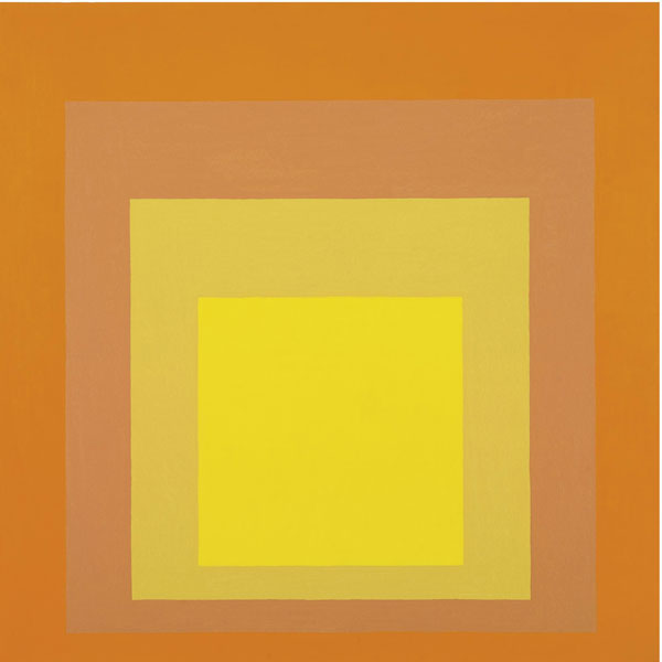
Joy
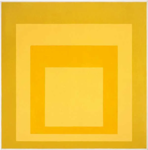
Diffused
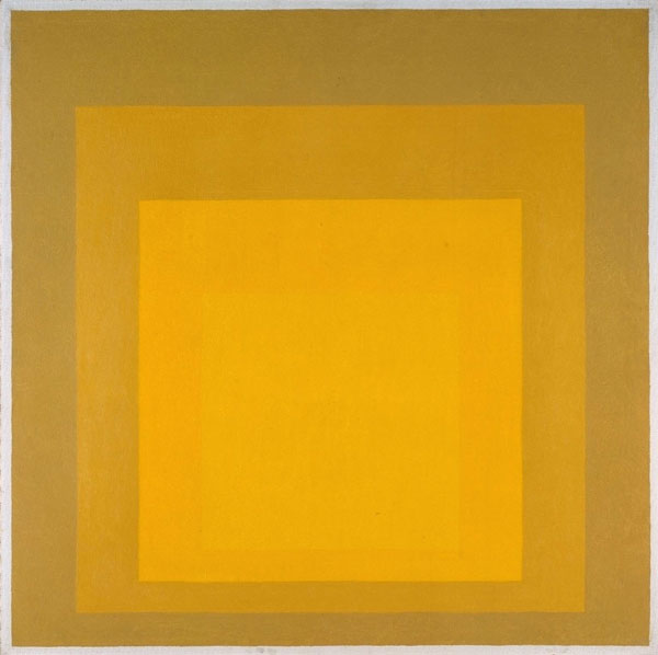
Ascending
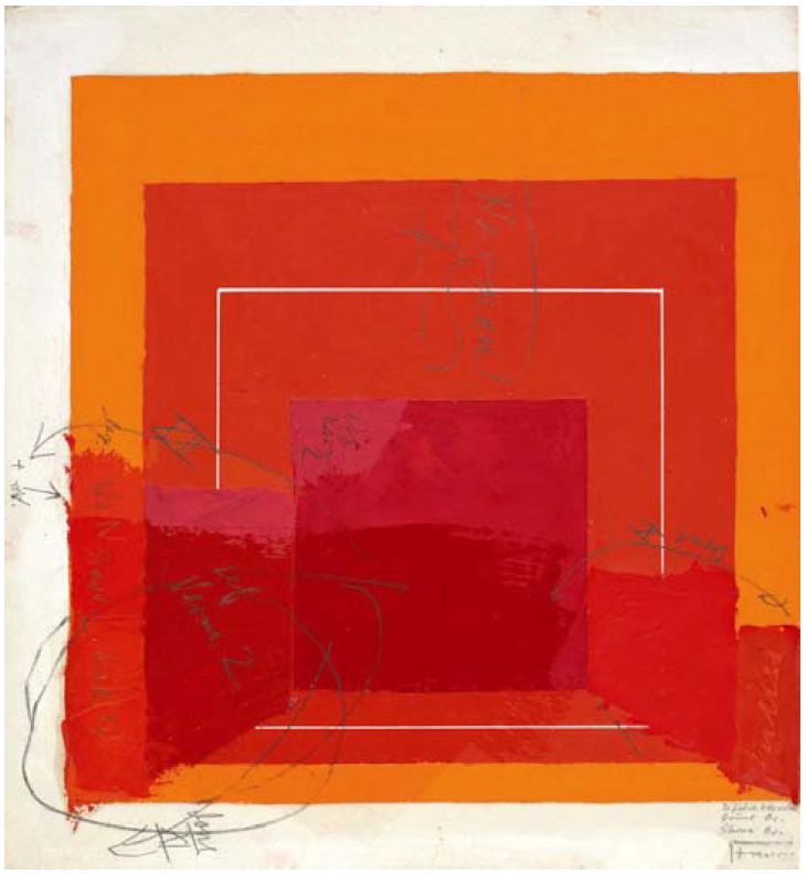
The process behind these outwardly simple paintings is revealed in this example of a study on paper. Albers tried several colors until jus the right combination came together.
Color with purpose
When we use color, we must do so with purpose. In addition to psychological and cultural things it can achieve, the optical effects of color are a powerful tool we can use in design. Seeing a combination of colors advance or recede feels very close to science, and when used well, will help achieve specific goals. It can attract attention, communicate hierarchy, or set a mood. Even copying a few of Albers’ (or other minimalist painters’) works and directly translating them into an interface or a graphic composition could help practice the skill of applying color sets with purpose.
Practicing color theory
To learn and practice the principles Albers developed, consider using the Interactions of Color app - a recent adaptation of the classic book that allows you to do the exercises faster than cut paper might. Note: most of the content is in the paidversion, but there is a sample chapter you can read and practice with in the free version.
Fun fact
When I was setting up the books to photograph a background for Design / Art Practice, I noticed how well the collection of Post-It notes matched the color examples in another classic work: Johannes Itten’s The Elements of Color (here is a public PDF of the entire book)
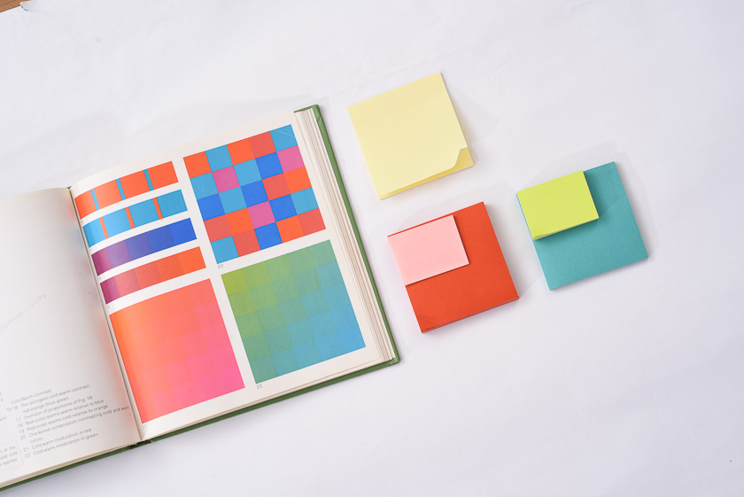
Did Post-It draw inspiration from the book? Or, perhaps, as graphic designers, we were attracted to the color combination that felt “classic” precisely because it was so similar to the book we may have studied in the past.
P.S.: If you'd like even more seasonal color goodness - go read my post about capturing the colors of fall leaves on the DockYard blog!

In it, I try to explain why you see the colors on the left, but get a photo looking like the blah on the right.