Ellsworth Kelly and balanced complexity
Complexity can seem like the opposite of minimalism. But when we have the right kind of complexity, and just enough of it, it adds depth, meaning and joy to a work. Pick a simple principle and stick to it to arrive at harmonious complexity.
Ellsworth Kelly painted Cité based on the laws of chance. He first created a paper study, with ink brush strokes across a page, and cut it into 20 pieces.

Ellsworth Kelly - Study for “Cité”: Brushstrokes Cut into Twenty Squares and Arranged by Chance, 1951. Source
He re-painted the result of the study onto wood boards after the pieces have been rearranged to achieve balance. The final painting looks remarkably similar, but on a larger scale.
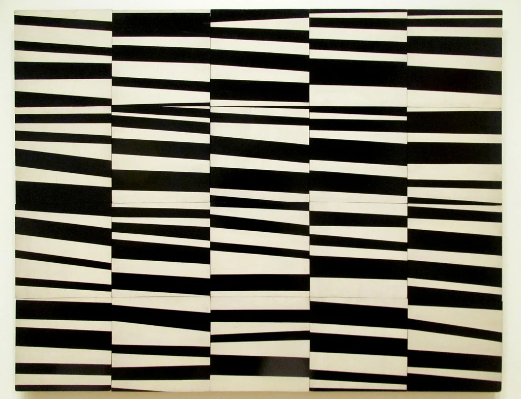
Ellsworth Kelly - “Cité,” 1951.
On a side note - this Kelly work seems especially prolific is I search for modern art based inspiration in different mediums. The fiber artist Kathleen Lumis made several pieces based on this graphical, chance-based technique. Kelly’s work feels surprisingly adaptable for quilting and other fiber arts, perhaps because of how the organic and geometric shapes are combined.
The complexity Kelly creates feels “just enough” for me. It feels balanced. With only one rule (the rearrangement of cut rectangles) and a graphical source material that is in a balanced relationship to the size of the cut segments. The black lines are neither too large, nor too small - so they don’t disappear in the individual wood panels.
What’s even more interesting to me - this visually quite detailed, “complex” painting can be called minimalist. The starting point (a series of graphic brush strokes) and the process ( cut, then rearrange) are both simple. This painting with many shapes on it makes sense and somehow feels natural, not crowded.
Principles

The result of laying one simple pattern on top of another. Both were hand drawn with the same tools, so there seems to be enough similarity to make this work.
Perhaps this feeling of balance comes from our brain understanding the underlying mechanics of an image even if we would not be able to describe or guess the process from looking at the result. I’ve observed a combination of these two things when I see something that’s just complex enough:
Similarity: it gives the composition rhythm and allows us to “read” it. Things that are similar make sense visually: understanding one gives us a clue about the rest, and eases the potential “work” we unconsciously have to do to read the surroundings. Seeing many similar things together also increases their effect. Retailers like Costco, Target and Uniqlo seem to use this effect quite successfully, making huge packages or stacks of the same item attractive to customers precisely due to their size.
Difference: offsets similarity and keeps us from getting bored. In the context of many similar things, we need some contrast to add meaning. Differences keep our attention, and keep the eye moving. I wonder (but have no scientific proof) whether the environment in which a person grew up (either anthropological, or cultural) influences the amount of difference, or contrast, they might find pleasing. While there are golden rules for this kind of stuff, perhaps, there’s also room for cultural differences.
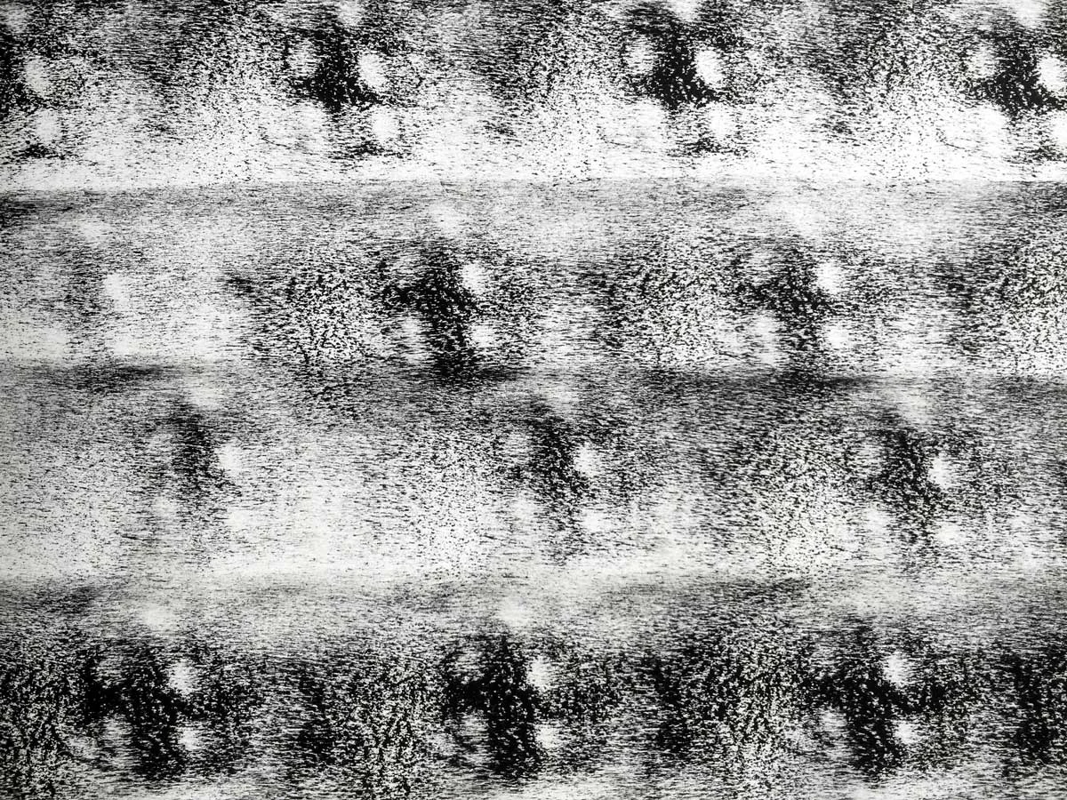
A texture I created with a sponge roller and a bit of oil based ink. These materials are not meant to work together, but I found the resulting mess beautiful.
An exercise in complexity
In true DIY fashion, I lifted an exercise straight from Ellsworth Kelly’s practice, and made a cut paper collage. I enjoyed how even and “patterned” my results turned out with this approach, especially for a very simple exercise. The result would probably be quite interesting if I were to cut each segment into pieces and rearrange those, so I’m noting this in my plans for the future.
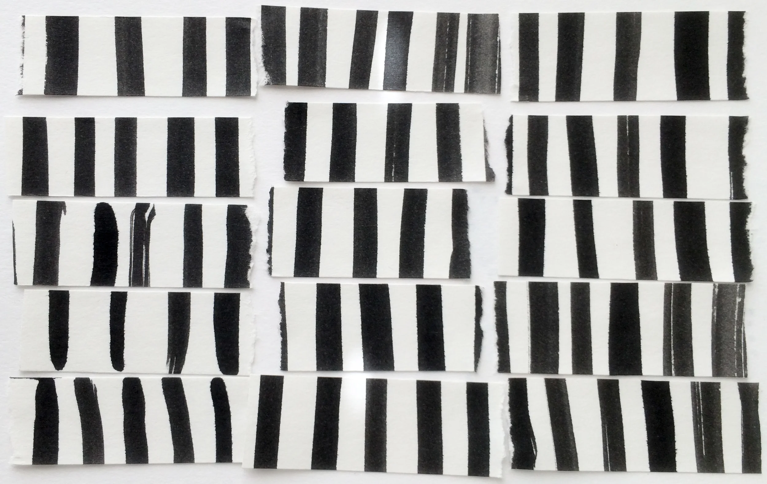
My quick paper exercise. It's a study of a study!
The rule based approach to arriving at complexity reminds me of the step & repeat rules in Conway’s Game of Life (the margins in the Google Search results should show an animation of this process)
Nature & range
When I am unsure how much range I need to get at the right amount of complexity, nature is a the cheat-sheet. How different are the sizes of leaves on a tree? What’s the range of textures, sizes and shapes in a pile of rocks on a beach? We are wired to accept these differences as natural, and therefore a solution closely copied from it will likely work.
Complexity in design
As a more practical exercise, I will be trying (or realizing I’m already using) sets of simple rules that enable complexity in my work. Rules like proportion, limited color palettes that allow variation within them, or even a baseline grid that sets the rhythm for an entire document keep us in check while allowing us to create contrast. With these rules and building blocks, we can make larger things that work.