Learn about color by painting
Last weekend, I treated myself to a workshop in watercolor painting with Laura Quincy Jones. My initial objective was to gain confidence and speed in quick watercolor sketches. I had done a similar watercolor with pen & ink style of illustration a few years ago, but wanted to improve my ability to control color, as well as learn how to get the most out of the medium.
Here’s a summary of what I learned.
Color behaves differently, depending on material
In preparation for the workshop, we were instructed to buy watercolor paint in tubes. Laura specifically stressed the importance of buying high quality paint (even when a budget is tight) and suggested that a more limited palette of better quality pigments would serve a beginner better than a wide variety of lower quality paints.
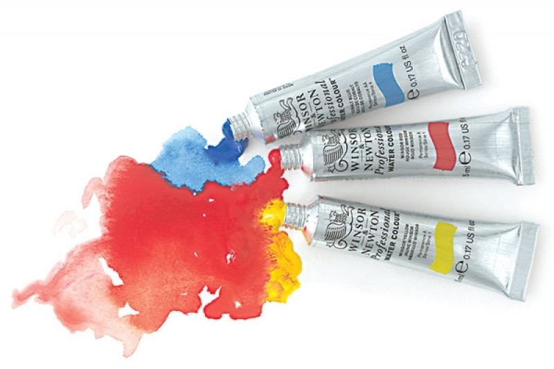
Even though I already owned a set of watercolor paints, I followed her advise and got new tubes of artist quality watercolors in primary yellow, red and blue. I was glad I did - the pigments felt much more saturated and vivid than anything I had used before.

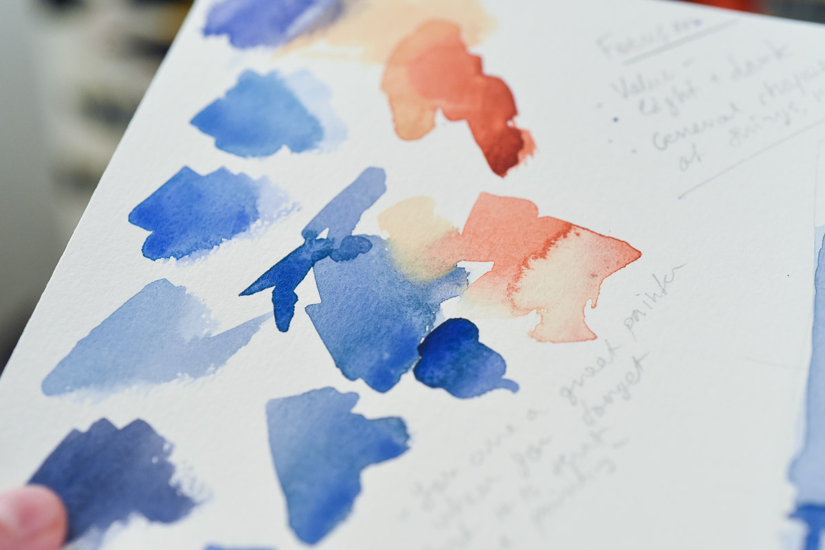
During the workshop, I also tested how different papers behave by painting the same quick study on four different surfaces - from extra rough to smooth. Because these papers adsorb water differently, the same pigment will feel more or less transparent depending on the surface roughness.
Mix real pigments to learn about color
As a designer, I work with mixing color on the screen for every interface I design. Typically, interactions like hover, a subtle drop shadow for clickable buttons, or a disabled / inaccessible state would call for shades and tints of the primary brand color. A quick trick to get “real” looking gradations of a color is to overlay transparent layers of one or more brand colors over black or white - or to combine two brand colors together.
Physical pigments behave differently. When two pigments mix, their different particle sizes and other properties often give unexpected results depending on the proportion of each color in the mix, as well as the concentration of pigment overall.

Artists' color reference books will often recommend specific complimentary colors to mix for consistent and pleasing effect. Now, instead of assuming that a color mixture would behave predictably (like transparent layers in Photoshop or Sketch), I will now consider sourcing color gradations from an artist resource book. Because the gradations come from real pigments, I can confidently use them with their quirkiness intact to add a bit of variety to my color selections. The results would still feel natural and balanced to the viewer.
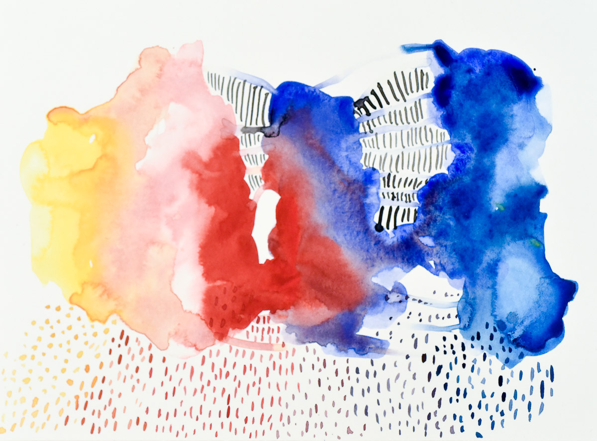
Mix a base color palette with two complimentary colors
For one of the exercises in the workshop, we mixed complimentary colors and their combinations to form the base color palette for a finished piece. With the base color choices established, we would then add touches of local color (the intrinsic color of objects) to complete the scene.

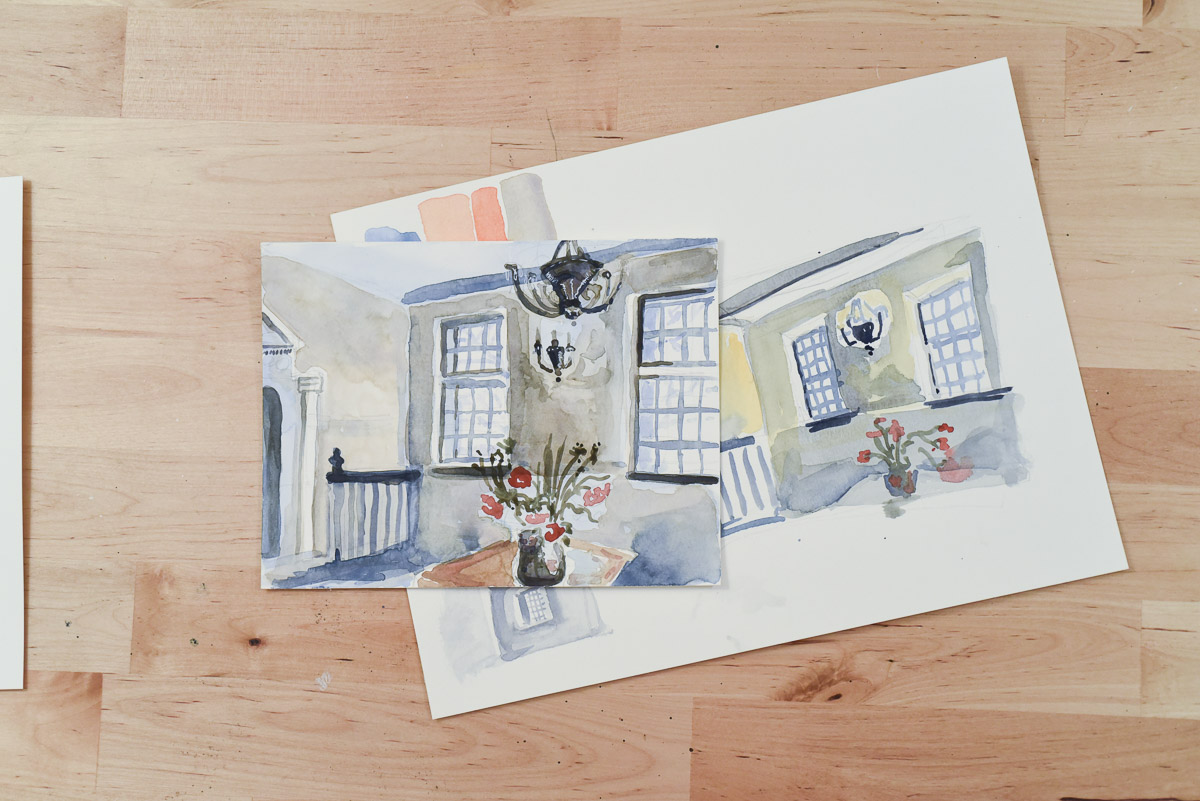
Taking an art class can be rewarding, even if you don’t intend to seriously take up a practice. I often hear from friends that they wish they could do more of an art technique they used to enjoy, or had more time for it in general. By scheduling my art practice (this workshop was 10-4 on a Saturday) I made a commitment to practice. If time is truly tight - try a smaller or online course you could do in between other commitments. But do make time to practice something that makes you happy creatively. You deserve it.