Looking at trends
Like art, fashion has a lot to offer as a source material for designers. Let’s look at seasonal changes and trends in fashion to help train the eye for trends and seasons in behavior and design, so we can make more informed decisions.
Rose Quartz (#F7CAC9), a PANTONE color of Spring / Summer 2016, will surely pop up in the near future.
I have long been fascinated by the sudden changes in color in clothing and fashion. Stores have this power: suddenly it’s mid-fall and the burgundy and orange sweaters give way to the jet black sweaters and we cannot resit. Three weeks later, the story repeats with jewel toned accessories that now look amazing and timely next to the dark sweaters and winter jackets.
Your Forever Color Forecast:

Approximate color palettes to predict every year ever
Changes in fashion are cyclical. We respond to the new, and to seasons - but color trends come back each year with surprisingly little variation. For example, it is possible to predict the general color trends that repeat each year by looking at the weather (if we take the US East Coast as a standard) and what one might be attracted to in that weather.
The yearly color popularity cycle repeats each year, with relatively small variations on the themes.

December
Holidays and sparkle. Colors are jewel tones (ruby, emerald, and sometimes a deep orange-red, burgundy, and gunmetal) and all variations of sparkle and metallics. These are set against a backdrop of black and dark gray as neutral - no “hippie” or natural browns, beiges or khaki colors are featured, to keep our focus as dressy and festive as possible.

January
Sudden awakening. New Year’s resolutions kick in, but we still have our christmas-gifted cashmere sweaters around. We crave light, and simplicity, and some sort of athleticism. Punchy, high contrast combinations of light gray, white, black and blue are popular. The blue especially, because it makes the multitude of black we still will wear in winter a bit more fresh and bearable, like a blue highlight in Superman’s hair.

February
A hint of spring somewhere soon. Lots of gray (it looks like the mist from melting snow), but against this backdrop - a combo of red and pink for Valentine’s.

March
It can start becoming spring officially, and there’s lots more light around. Bright skies. A deep vivid blue in the sky. Neon yellow or green in small patches against a lighter backdrop of gray. Anything but the tired winter-facing darks. At this time, it is acceptable to trade your dark-wash winter jeans for the light-wash spring & summer ones.

April & May
Even more bright! Stores enthusiastically feature all-white breezy cotton looks, while most of us still slosh through the mud and snow. But we’re ready for it to be over! Any bright color (check the Pantone palette for the year!) In addition to all-over-white, you’ll see an almost-neon peachy red, a yellow-green or a light peach all signal spring.

June
It’s summer! Floral and bright and super happy. Saturated orange-red, against a sunny backdrop. The neutrals are back to colors good for hiding in the woods: browns, khaki and sand.

July
Dark navy comes back, with white. It is a classic and with all the bright colorful things, we need that counterpoint. Think of what a local might wear on an island with white painted walls, and lots of sunshine. Or someone with a small house on Nantucket. Or someone who wishes she had a small summer house on Nantucket. Importantly, this palette converts with minimal adjustments into a patriotic red, white and blue.

August
Jewel-fall tones looking into September, but still with a summery look to them. Dark green emerald, deep blue, and burgundy but combined with brighter accents.
In addition, August seems to be the most dressed-down month of the year as we prepare for “back-to” everything in September. The color of sun-bleached black or dark indigo, a kind of bluish dark gray, that goes well with tanned (but not winter-pale) skin.

September
Back to business and dressier looks. This is the time to wear the Color Of The Year, be it fuchsia or burgundy, or Marsala or Tangerine Tango. Dark denim is back.

October
Whatever shade of orange and burgundy was not popular last year. Also, blue and turquoise look mighty good next to all the fall foliage, and as a contrast against the burgundy-orange business.

November
Foliage is mostly gone, but now the winter charcoal and black look refreshing and not yet tired. Plus, deep burgundy and purple.
Seasonal trends
This is how colors tend to change seasonally in mass market fashion. Colors operate on this cycle not only because of the need for constant change in fast fashion, but because the context (weather and light) changes.
Anywhere we look, we can identify trends and cycles. Because of the things that determine those changes operate on different scale, change also happens at different speed. Stewart Brand describes this in the concept of Pace Layering.
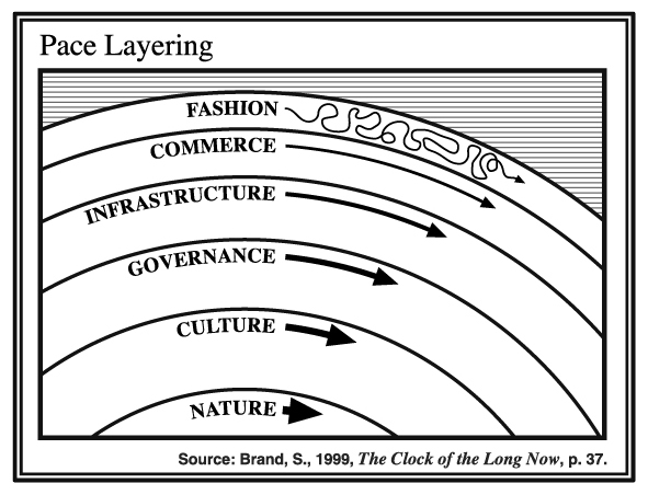
Fashion moves the fastest, and nature (think geological time, not seasonal weather changes) moves slowest. Looking at the cyclical changes in the behavior or environment we are designing for, as well as the pace at which they happen, can help us make design decisions in two ways:
- Observe the seasons in the thing you’re trying to design and know what’s coming, so you can prepare for it.
- Observe the seasonal changes, and ignore them. Focus on what stays the same and design for that because it’s more permanent.
In the meantime, I am wearing mostly black and gray, and add a saturated primary color scarf almost daily - in defiance of seasonally prescribed trends.