Sign Painting & what a Designer should Learn from a Craftsman

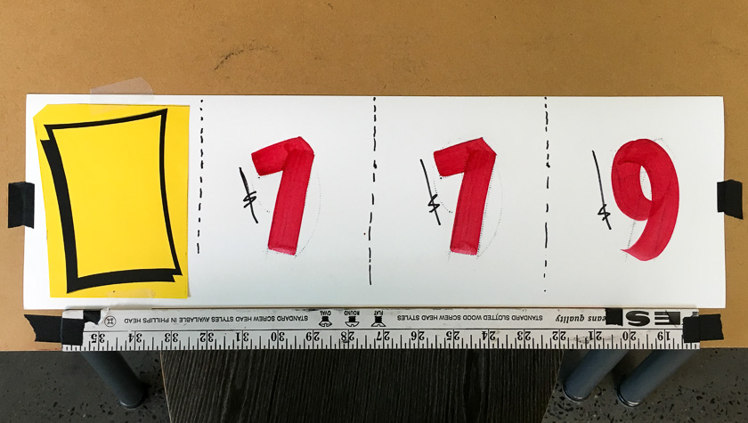
Single Stroke painted letters - example by John Downer
This article is going to be a bit different. We won't look at a fine artist, but instead a craftsman. There are many parallels between artists’ processes and craft practices. Both can teach designers a lot when we know where to look.
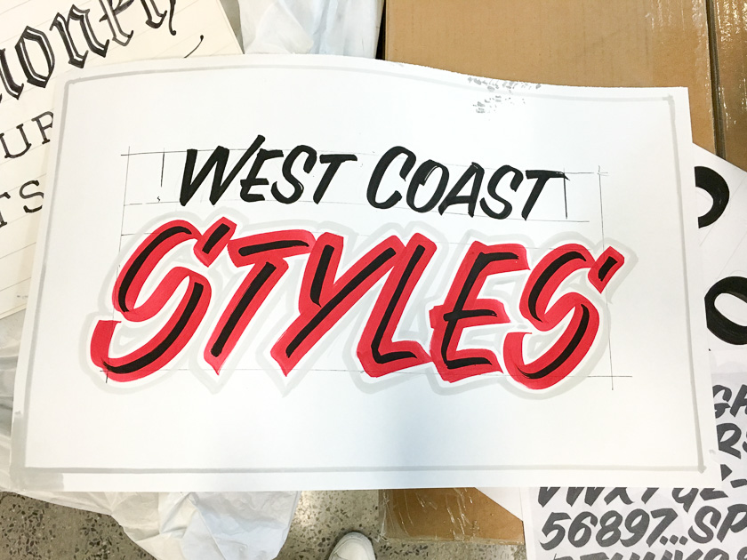
West Coast style single stroke sign painting technique example by John Downer
I regularly take courses at the Cooper Union’s Type@Cooper program to develop my design skills. Learning about typography and its related disciplines is a fundamental skill for a visual designer, and the instructors at the Cooper Union consistently teach intensive and high quality courses.
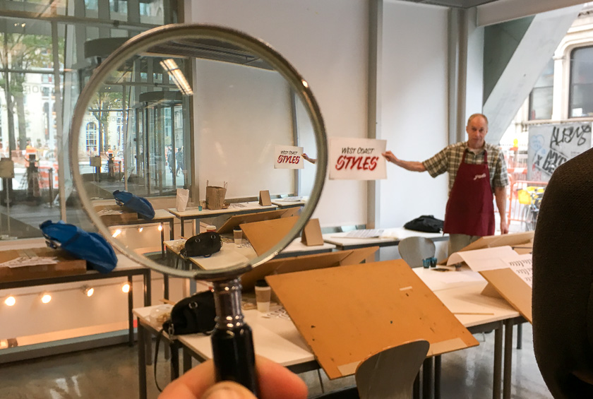
The latest one I took was John Downer’s Sign Painting: Speed Stroke Brush Lettering To get an idea, you can watch a demonstration of the single stroke technique from summer 2014.
Artisan principles apply to design practice
As we were practicing basic strokes (very shaky at first), John shared wisdom from his many decades of practice as a journeyman sign painter. Most of it applies to a designer’s practice.
Approach sign painting craft from the standpoint of efficiency and customer service.
Just like designers need to understand and address users’ and clients’ goals, a sign painter needs to solve a problem for a specific customer. Efficiency becomes important and a mark of professionalism: while it is possible to “over-deliver” and produce time-consuming, detailed lettering for a quick, simple job, it would put a sign painter out of business.
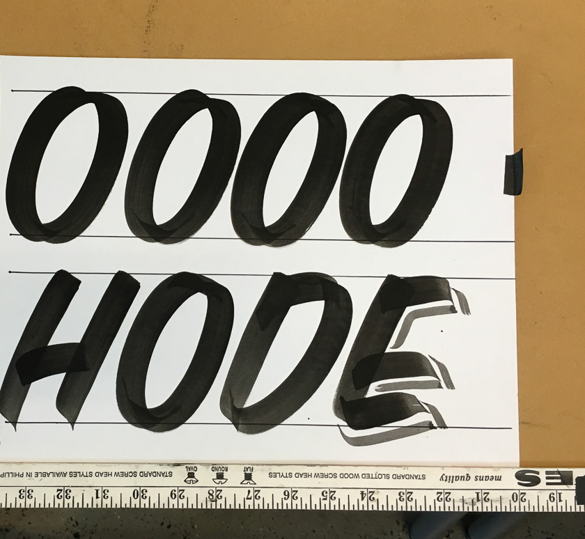
The single stroke letter is an efficient sign painting technique because it requires fewer strokes to produce, compared to a letter built up from many strokes. As a sign painter gains expertise, they become skilled not only at producing the most beautiful and legible letters, but also at doing just enough work to solve a problem well in a short amount of time.
Another example of the efficiency approach is the shading of the capital ‘E’. An experienced sign painter will nearly always apply shading on the side of the letter that requires fewer strokes when the layout allows for it.
Similarly, if a letter of a desired weight can be painted in the single stroke technique using a wider brush (or a stronger pressure on the brush), it will be. Using a narrower brush and building up the width of the letter with several strokes would take a longer time and decrease efficiency.
Start with the ephemera
When learning a craft like sign painting, it is best to start by doing many “throwaway” pieces - for example, quickly painted price tickets. A complex gold-leaf sign for a shop window would be the wrong way to break into the industry and gain experience. The principle of quick iteration and “non-precious” drafts also applies to learning visual design basics.
Don’t forget basic rules and hierarchy
On paper, the importance of planning becomes evident: with no easy undo, a sign painter will plan the non-negotiable, high-priority things first: the margin and the position and size of the biggest word in the sign are the first pencil marks that go on a sign.
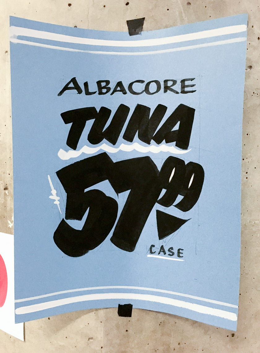
Efficient & effective techniques are an added benefit of proper planning. For example, a three color price ticket can be made with white paper, color paper, and black ink but feel like something more complex with comparatively little effort.
Some things act as multipliers
One of the benefits of learning from a truly seasoned professional is that they will be able to teach why the basics matter so much in any practice. For example, posture and basic stroke technique seem like simple concepts and are easy to overlook as we attempt to master more advanced concepts. However, the basics act as a multiplier because we are building on top of them for anything else we do.
For UX design, I aim to learn as many keyboard shortcuts as possible for my top 2-3 software tools. File naming, versioning, and a sequence of steps to begin any project are all just as important as posture. They can act as multipliers later on in the process and allow me to do better work.

A non-romantic view of what “handcrafted” means
Hand painted signs and lettering can be seen as a rarity (in fact, they are more common than you might think.) It is easy to treat anything hand-rendered as a rarity, rather than focusing on the qualities that differentiate hand painted letters from those typeset on a computer. Throughout the workshop, John emphasized the importance of tailoring the letters where necessary and, conversely, not being afraid to automate where reasonable.
Automation vs. tailoring
For repeated processes, there is no shame in using a template to save time and effort. If a sign painter can work faster by using a template to pencil-in repeated characters or digits they will become more efficient. With the time saved, they can put more effort into a custom solution in a more prominent portion of the sign. The overall effect will be a more eye catching sign, and the customer will be served better than if the painter had spent all the time painstakingly rendering the minor details.

Learn “why” to spot the rookie mistakes
Learning the structure and the tools used to render letters in a specific style will prevent certain rookie mistakes. For example, after practicing with a brush, I started seeing why the ends of strokes can point in one direction but not another. The width and behavior of a brush also dictates an acceptable range of stroke weights that would be reasonably possible to paint. Anything outside the range of a letter being 4x…10x the stroke weight would be difficult to paint and therefore would look like a mistake if imitated.
Why learn from a master of an “old” craft?
Learning from a seasoned master, and focusing on learning one style, allows a deep understanding of the techniques and reasons behind them. For example, John Downer focuses on the West Coast style of sign painting (coming from the Pacific Northwest). There is a distinct look of the Chicago school, and he chooses not to mix it in to his work. Focused learning of one style from a well curated source is very important: it can counteract the overwhelming amounts of mixed inspiration we can get on the Internet when we don’t know what to look for.
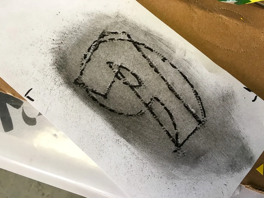
John Downer demonstrates how to evaluate your work in progress
How does this stuff apply to the work I do every day?
The single stroke sign painting workshop was a rigorous exercise, tightly focused on one technique. While I might not apply this exact sign painting style to my design work on a regular basis, the careful study of letter shapes and the relationships between them helped me refine my eye for balanced layout and relationships between elements.
But I see a more important benefit from this intense workshop. Because I studied a very specific art (or design?) form that has influenced a lot of the visual culture around me, I can now read the influence of sign painting in more places than I had expected. The speed limit on the highway, the price tickets at the sandwich stand, and pretty much all the rest of the commercial signage I see now “snaps into place” to reveal these influences. (The word vernacular comes to mind.)
Learning or refining a craft related to design will enrich your practice beyond the typical understanding of “job skills” because design touches so many things. I highly recommend it!