Word & Image: Chip Kidd
Designers tell a story through careful selection of word and image. The process is closer to art than science. It can be frustrating when nothing seems to be just right. Chip Kidd’s work can help find possibility instead of a dead-end.
Design Shows, and Tells

Designers must solve a problem, and also communicate with an audience effectively. The tension, or extra clarity that a combination of word and image can produce is a key tool for communication in graphic design. We often struggle to illustrate a concept just right - think of how difficult it can be to select a hero image for a website. Changing that one element alone can completely change the story a page (or, by association - the whole product or brand that page describes).
Let us look for some examples outside of our industry so that we can get better at this word & image thinking.
Never show & tell the same thing
Chip Kidd in The Cheese Monkeys defines a fundamental rule in Graphic Design by explaining that we should either write the word ‘apple’, or show an image of an apple. Doing both at the same time would insult our audience’s intelligence.
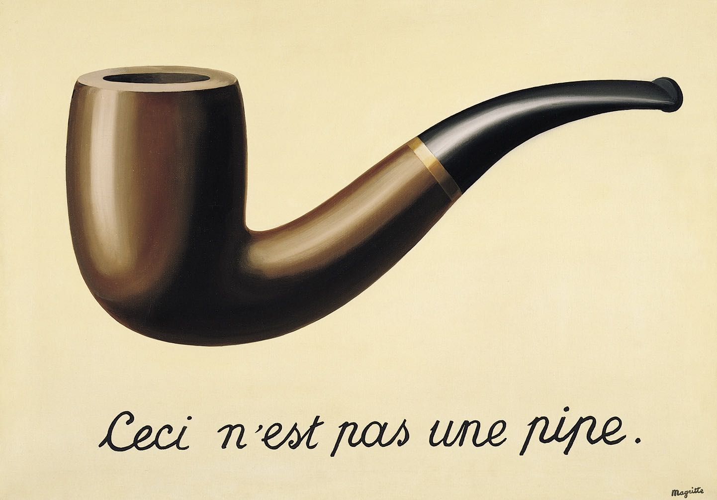
How DOES one properly illustrate this concept without doing thevery thing it tells you not to do?
Word & Image in Chip Kidd’s Work
A book jacket needs to do two things: represent a large amount of content concisely, and also attract attention among many other covers at the same time. It’s a tough job, but that’s what makes it a great example to learn from.
Chip Kidd nails both the punchy design to attract a new customer and make them consider reading it, and the nuance required to address an entire world within the book. Kidd’s covers reveal layers of meaning, which is especially important for someone like the author. Authors love Kidd’s work. The powerful potential of the play between word and image is never wasted: they never both say “apple”.

A plush bunny turned on its head represents a traumatic situation without showing too much.

Dry is about a battle with alcoholism. While this could have been any representation of the alcohol, Chip Kidd, brought the concept of "not dry" directly to the reader. With a strategic coat of clear gloss, the effect of ink running off the page was so strong that people examined the book to see what might have ruined the covers.
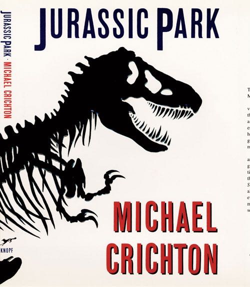
One of Chip Kidd's most prolific pieces of design, the Jurassic Park skeleton dinosaur continued on to become an iconic poster and countless pieces of film memorabilia. Without any living dinosaurs available, Chip Kidd was still able to represent a lifelike character by giving it an in-between silhouetted look. Neither fully alive, nor a pile of bones.

The chosen photo implies nakedness without showing it. Wholesome!
A critical look at a painting often calls for an examination of the back. Is it a fake? How old might it be? The solution of showing an unmistakable part of the process - looking at the back - is elegant and simple.
Cover images via ChipKidd.com
How to Pick Images for stories
Chip Kidd’s work is an enigma: it is at the same time “obvious” and clever. And while I’d love to be able to work out metaphors on the same level every time I need to finish up an interface design and realize I’ve still got a beautiful, but placeholder image in there.

Like this one maybe? It’s a popular one by Jordan McQueen on Unsplash, and it could well stand in for a hero, working out the philosophical question of whether this image might fit or not. But by showing a person thinking, as we describe them thinking, we’re labelling the apple with “apple”.
In between a perfect image, custom-made for the story it tells, and nuanced (like Chip Kidd’s) and a banality (yes, it is possible to use this beautiful photograph in a banal way), we can find a compromise.
My compromise solution to illustrate this article was using the Creative Commonsphoto of an orange to play inside the “apple” focused wireframe.

What’s yours?