Painterly quality and the snapshot aesthetic
Understanding the difference between a painterly work, and the snapshot aesthetic can help us think about design in two opposing (but not mutually exclusive) ways. Did the author build a system, then have a party inside - or take time to craft every little detail?
What does “painterly” mean?
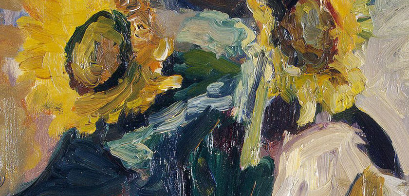
Henri Matisse - Vase of Sunflowers (1898) - detail
The definition of the painterly in, well, painting is that you can see the brushstrokes. The opposite of a painterly style is linear and graphic (for example, Ingres’ or Botticelli’s work, based on meticulous preparatory drawings).
This style has, by definition, intentionally placed brushstrokes. It’s interesting that in Matisse’s time, the intentionality of placing each mark by hand in order to make an image was an assumed default; today the default might be photography or computer retouching.

Henri Matisse - Vase of Sunflowers (1898)
Because brushstrokes are made in a consistent manner, paintings often have a pleasing, harmonious texture. This texture is not always easy to detect - but the consistency of the surface will give us unconscious pleasure. Inconsistencies in texture and pattern that result from using different tools on part of a painting can also help detect forgeries, or help determine the date of modifications to an artwork.
The painterly in photography
When we are talking about photographs - does the idea of painterliness really apply? Because a photo is captured “from life”, the artist has to make a decision to frame the subject and leave out the surroundings. This process is the opposite in painting, where the artist consciously adds every detail until the final composition is achieved.
But in the post-processing stage, the photographer can use processes that feel much more painterly than photographic.
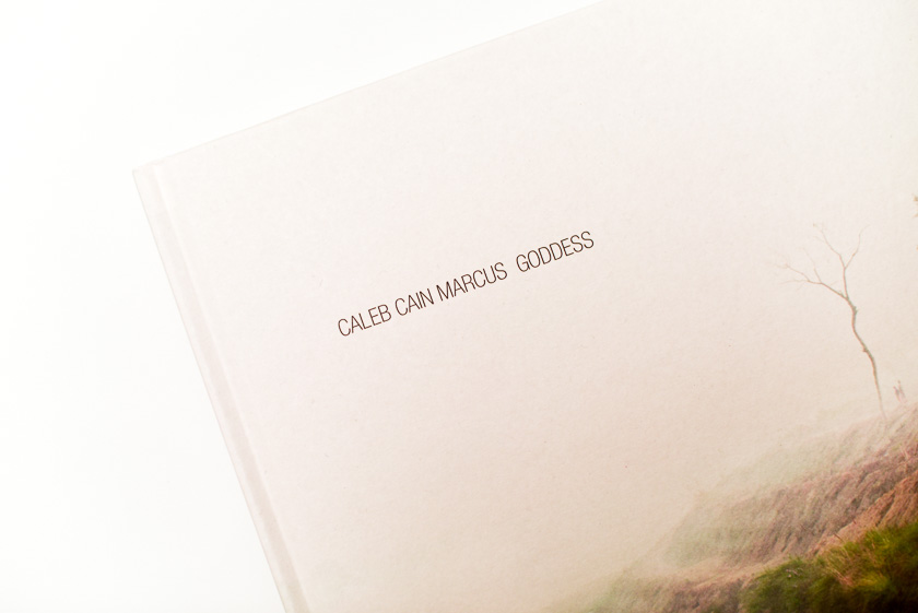
In the introduction to GODDESS, Caleb Cain Marcus describes his process:
“While working with these photographs, color and contrast have been concurrently built up over time, layers of adjustments made over the course of many months. Every adjustment slowly excavates the color by enhancing a specific hue. Often twenty or more prints were produced of a single image, each alteration becoming progressively subtler until the color is beckoning the viewer like a shiny disc at the bottom of a pond…”
With this process, the deliberate, built-up elements of color and light become poetic.
The snapshot aesthetic

If Andy Warhol creates The Factory, and within it he, or an assistant makes the art (or document the parties) - the artist is still managing the environment that had produced an image, but does so by framing, more than than hand-crafting an artwork.
The photographic in painting

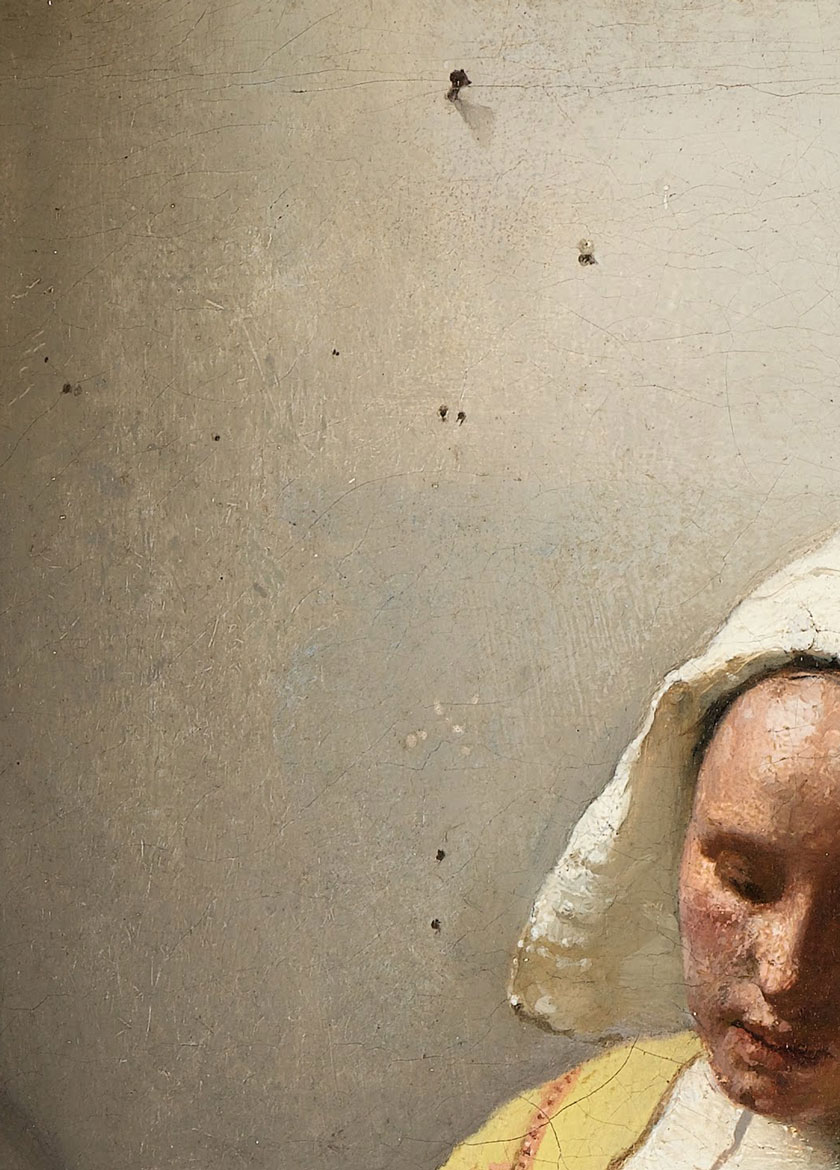
The Milkmaid (1657) - Vermeer
For comparison, let’s look at the photographic influence in painting. As Tim’s Vermeer shows, a lens and a mirror were likely used to paint The Music Lesson and other works. Vermeer captures the gradation of light at a level of precision that a human eye could not detect. The painting therefore shows qualities that an artist might not have been able to place in it intentionally, and is somewhat photographic in nature.
The intentional in design
So the un-photographic, deliberate decision-making by the artist is what gives painting the painterliness. (Feels like designing for delight in the details!) But a design process can also feel like a photographic snapshot, if we build the larger system before zooming in on the details and special cases. (Feels like a design sprint!)
So we can use the difference between the painterly and the snapshot aesthetic as two alternative ways in which to think about and evaluate design.
Looking at a designed system (a layout, or an app, or a visual design) in a painterly way, we would seek out a consistency that stems from the intentional addition of each element. If a design decision does not serve the overall purpose of the project - reconsider it. If a feature or a designed element feels “random”, and can be removed without detracting from the effectiveness of the whole piece - remove it. Thinking in this way, we might look for a harmonious relationship between lines in an illustration, and the weight of the type on a page - or a modular system of text and button sizes used in an app, where a specific size always corresponds to a specific level of hierarchy.
Looking at design with the snapshot aesthetic in mind, we consider the larger context and whether all the design decisions would be likely, given the over-arching aesthetic. (Would this chair belong at Warhol’s party?) Would the greater ecosystem around the product I am trying to create likely generate this specific feature? Most of the effort here might go into understanding or recreating a culture around the thing we’re making - to the point that it becomes so established and detailed that any “snapshot” taken within would make sense and follow its intrinsic rules.
Use both the painterly and the snapshot aesthetic to evaluate design decisions
Both will likely apply to some extent.
Think of the design as a snapshot if a larger ecosystem. How does it function? Or think about the design as a series of carefully placed strokes. Do they all belong?